

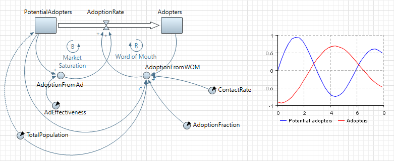
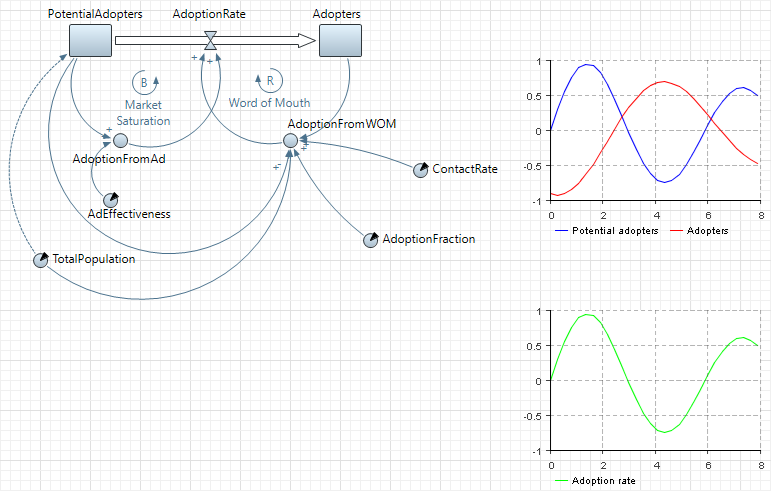
You can also observe how the values of variables change during the simulation using charts. Namely, we want to examine the adopter and potential adopters populations dynamics. We will also add a chart to show how the adoption rate changes in our model.
Draw a time plot displaying adopter and potential adopter population pools
- Drag the
 Time Plot element from the
 Analysis palette onto the graphical editor.
 - Resize it as shown on the figure.
- Go to the Properties view.
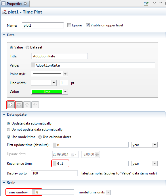
- Open the Data section of the Properties and specify two data items to be displayed on the time plot.
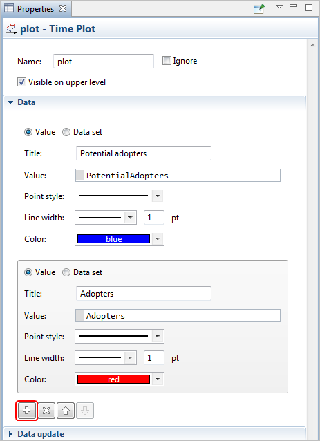
- To add data item, click the
 Add data item button and define settings for this data item in the property section above. Type PotentialAdopters in the Value field. Specify the item’s title in the Title edit box: Potential adopters. It will be displayed in the legend displayed for this data item.
 - Add another data item with Value: Adopters in the same way.
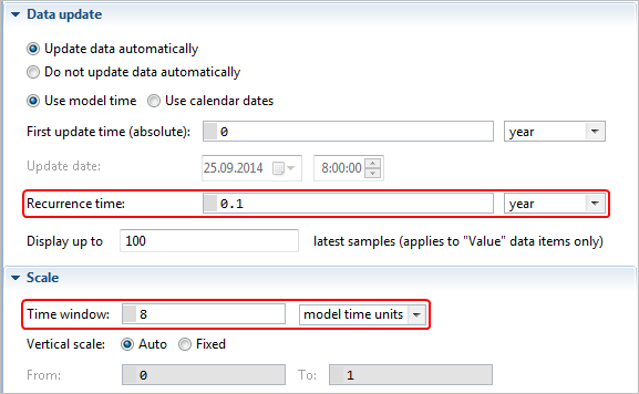
- Set up the chart’s time diapason. Open the Scale section of the properties and type 8 in the Time window edit box (so the chart will display all the simulation run).
- Define how the plot will be updated with new data set values. Open the Data update section of the properties, choose Update automatically option and specify the update rate in the Recurrence time edit box to the right: 0.1.
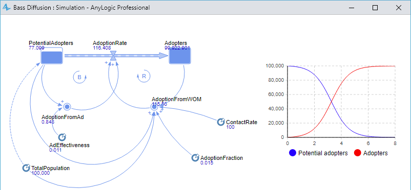
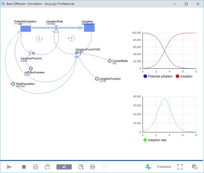
Now you can run the model and examine the trend of potential adopter and adopter populations over time. You will see classic S-shaped diffusion curves.
Now we will create a chart to show how the adoption rate changes in our model.
Draw a time plot displaying adoption rate
- Create another
Time Plot in the same way:
- Configure this plot to display AdoptionRate:
Run the model. You will see classic bell-shaped curve.
-
How can we improve this article?
-