

We have created the model simulating pedestrian flows inside the subway entrance building. Now we want to get some statistics on the flow. The most powerful tool used in pedestrian simulation is Density map.
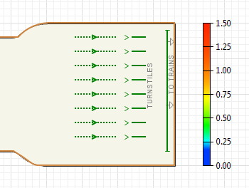
Display the pedestrian density map
- Drag the element
 Density map from the Space Markup section of the
 Pedestrian Library palette into the graphical editor. The element acts as the color scheme. At the runtime it will show the density map legend. This density map legend helps to understand what colors on the density map mean what values. Legend displays the correspondence between density values and colors on the density map.
Now you can run the model and observe its behavior.
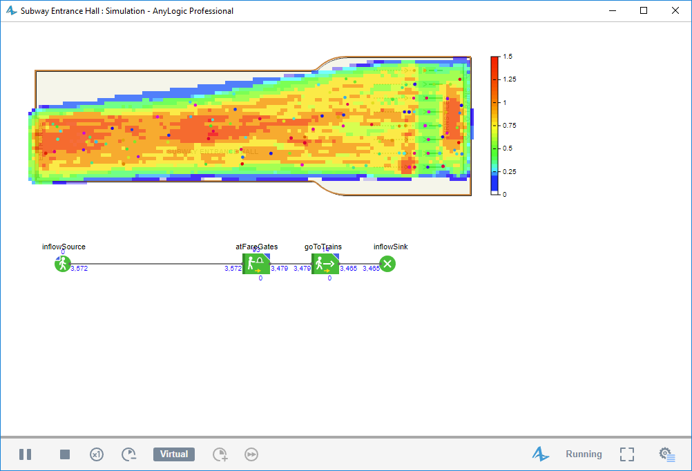
You will see that as pedestrians move in the simulated space, the layout is gradually painted in different colors. The color of every point of the space corresponds to the current density in this particular area. The density map is constantly repainted according to the actual values: when the density changes in some point, the color changes dynamically to reflect this change. In case of zero density the area is not painted at all.
The density map is commonly used to detect the areas with critical densities. Red color indicates the critical density (by default it is equal to 1,5 pedestrians/m2). You can change this value in the Density Map's parameter Critical density (shown in red), peds/m2. Blue color is used for low densities. When the density in some area is zero, the density map for this particular area is not drawn at all. The legend shown in the figure above tells us e.g. that yellow color on the map corresponds to the density 0,75 pedestrians/m2.
By default AnyLogic uses logarithmic color scheme. In this case the color changes logarithmically from the "minimum" (blue) color to the "maximum" (red) color. This color scheme is frequently used when you need to pay attention only to the density values close to the critical value threshold. You can change the logarithmic color scheme to the linear scheme by choosing Linear option in the Density Map parameter Color scheme. It is the simplest color scheme: color changes linearly from the “minimum” color to the “maximum” (red) color. You can even define your own color scheme by choosing the Custom Color scheme and defining the correspondence between colors and density values in the Custom color parameter of the Density Map.
You may notice that even when there are no pedestrians at all in the area, the density map may be drawn there. The reason is that density map may either display maximum observed density values (if attenuation is turned off), or the actual density map for the recent period of time (if attenuation is turned on). By default attenuation is turned on. With the attenuation being turned on, when the density goes down, the color for the corresponding zone on the density map changes correspondingly (but not immediately, with the specified delay). To turn the attenuation on, select the checkbox Enable attenuation in the Density Map properties.
If you are not satisfied with the density map painted over the layout and making it hardly visible, you may increase the transparency level for the density map using the slider Transparency in the Density Map properties.
Demo model: Subway Entrance Hall — Phase 3 Open the model page in AnyLogic Cloud. There you can run the model or download it (by clicking Model source files). Demo model: Subway Entrance Hall — Phase 3Open the model in your AnyLogic desktop installation.OK, almost everything was said about the pedestrian density map, and we can go on further with adding new logical details in our model.
-
How can we improve this article?
-