

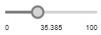
The control that lets a user graphically select a numeric value within a bounded interval by sliding the knob.
Slider elements are commonly used for modifying values of numeric variables and parameters at the model runtime.
Use sliders to choose an int or a double value from the defined range. To work with text variables or parameters of String type, use text input in the edit boxes instead. To control the values of boolean type variables, use the check boxes.
Demo model: Slider Linked To Parameter Open the model page in AnyLogic Cloud. There you can run the model or download it (by clicking Model source files). Demo model: Slider Linked To ParameterOpen the model in your AnyLogic desktop installation.To add a slider
- Drag the
 Slider element from the
  Controls palette into the graphical editor.
 - Navigate to the Properties view.
- Using the Orientation group of buttons, choose, whether you want your slider to be Horizontal or Vertical.
- You may want to bind a slider with a numeric variable or parameter (on changing the value of the slider, the linked parameter/variable immediately gets this value). To learn how to link a slider to a parameter, refer to Linking a slider to a numeric parameter or variable.
- You can also define any action to be executed each time the slider’s value is changed. Type the code you want to execute into the Action section of the slider’s properties (the current value of the slider is available here as value (local variable of type double)).
- If you want to add labels displaying minimum, current, and maximum values of the slider, click the Add labels button in the slider’s properties. You will see min, value and max labels added to the slider. Their dynamic properties are set up to display min, current, and max values of the slider at the model runtime. These labels are regular text shapes, which can be relocated, resized, deleted, and recolored.
- General
-
Name — The name of the slider. It is used to identify and access the control from code.
Ignore — If selected, the slider will be excluded from the model.
Visible on upper agent — If selected, the control will be also visible on the upper agent where this agent lives.
Lock — If selected, the slider is locked. Locked shapes do not react to mouse clicks — it is impossible to select them in the graphical editor until you unlock them.
Orientation — Orientation of the slider, either Vertical or Horizontal.
Link to — If you want to bind the slider with a numeric variable or a parameter (on changing the value of the slider, the linked variable/parameter immediately gets this value), select this checkbox and enter the name of the variable/parameter that you want to link to the slider.
Minimum value — The minimum value of the slider.
Maximum value — The maximum value of the slider.
Step — Here you can specify the increment in which the slider's knob can move along the interval from the minimum value to the maximum value. The step can be of either int or double type. The default type is double.
Default value — [Visible if the Link to checkbox is not selected] The expression that defines the default slider value. If this slider is linked to some variable or parameter, it uses the default value of this variable/parameter (or the nearest possible value from the slider's range of available values) as its default value.
Enabled — Here you can specify the boolean expression determining whether the slider is enabled or disabled.
Add labels — Click this button to add labels displaying maximum, minimum, and current values of the slider (min, value, max). The dynamic properties of the labels are set up to display min, current and max values of the slider at the model runtime. These labels are regular text shapes, which can be relocated, resized, deleted, and recolored.
- Action
-
Here you can type the code to execute when the user changes the slider position. The current value of the slider is available here as value (variable of type double).
- Position and size
-
Level — Level to which this control belongs.
X — X-coordinate of the control’s upper left corner.
Y — Y-coordinate of the control’s upper left corner.
Width — The width of the control (in pixels).
Height — The height of the control (in pixels).
- Advanced
-
Visible — The control’s visibility. The control is visible when the specified expression evaluates to true, otherwise it is not visible.
Replication — Dynamically specifies the number of copies of this control to create. Leave empty to place a single control.
Show name — If selected, the name of the control will be displayed on a presentation diagram.
A slider is frequently bound with a numeric variable or a parameter (on changing the value of the slider, the linked parameter/variable immediately gets this value).
To link a slider to a parameter
-
In the slider’s properties, select the Link to checkbox and choose the parameter/variable from the combo-box to the right:
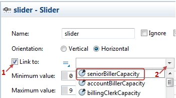
- The pop-up list shows the names of all parameters and variables of the valid types, and also all the flowchart blocks present on the diagram of this agent. To link to a parameter, just select the parameter in the list.
-
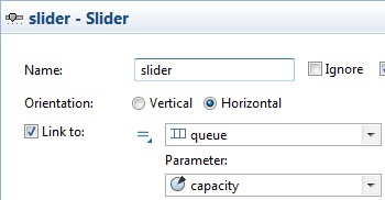
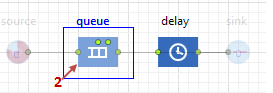
If you want to link the slider to a parameter of a flowchart block (for example, the capacity parameter of the Queue block), you should first select the flowchart block’s name in the drop-down list, and then choose the parameter from the Parameter drop-down list below:
Another way to link to a parameter is to select the required parameter, or the flowchart block in the graphical editor.
To link a slider to a parameter by selecting it in the graphical editor
-
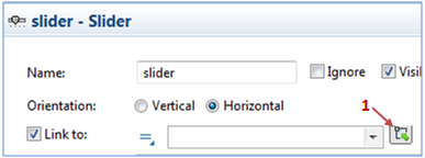
Select the Link to option, and then click the button to the right of the drop-down list.
-
If you are linking your slider to a parameter, select the parameter in the graphical editor. If you want to link to a parameter of a flowchart block, select the corresponding flowchart block:
-
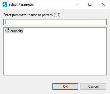
You will see the dialog box showing the list of parameters of the flowchart block that you can link a slider to. Select the required parameter from the list, and its name will be automatically inserted in the corresponding property of the slider.
You can set the value of the slider:
- manually, by sliding its knob to the preferred value
- by changing the value of the linked parameter or variable and passing it as an argument of the slider’s setValue(value, callAction) function
In case of using the value of the linked element to set the value of the slider, the new value can be outside of the slider’s step grid, defined in the Step property of the slider, or the slider’s range, defined by the slider’s Minimum value and Maximum value. In this case, a warning will be appear in the Console view, the knob of the slider will move to the closest value that fits the slider’s specified Range and Step, and the linked parameter or variable will be set to this value as well.
- Obtaining the current value
-
Function Description double getValue() Returns the current value of the slider. int getIntValue() Returns the current int value of the slider.
This function may only be used in sliders linked to parameters or variables of type int. - Setting new value
-
Function Description void setValue(double value) Sets the value of the slider. If you call this function at runtime and set the new value out of the specified range, the slider’s value will be corrected to the closest possible value inside the slider’s range and step grid and a warning will be displayed.
Doesn’t execute user action code.
val — the new value.void setValue(double value, boolean callAction) Sets the value of the slider. Action is executed in the same thread.
Executes user action code (if there is any) if the callAction parameter is true.
If you call this function at runtime and set the new value out of the specified range, the slider's value will be corrected to the closest possible value inside the slider’s range and step grid and a warning will be displayed. If the user action code refers to the new value, the corrected value will be applied.
value — the new value.
callAction — if true, user action code will be executed (if there is any).void setValueToDefault() Sets the value of the slider to what was provided as the default one.
Doesn’t execute user action code. - Values range
-
Function Description double getMin() Returns the minimum value of the slider. double getMax() Returns the maximum value of the slider. void setRange(double min, double max) Sets the minimum and maximum values of the slider.
Doesn't execute user action code.
If the slider is configured to work with int values (linked to a variable or parameter of the int type), the given [min, max] range may be automatically corrected to have integer bounds (within the given double bounds). This function does nothing if the slider already has such range.
If the current value of the slider is out of the new specified range, it will be snapped to the closest possible value inside the slider's new range. The value of the linked parameter will remain unchanged.
min — the new minimum value.
max — the new maximum value.void setRange(double min, double max, boolean callAction) Sets the minimum and maximum values of the slider.
If the value of the current slider changes, the function will execute user action code (if there is any) in the same thread — if the callAction parameter is true.
If slider is configured to work with int values (linked to a variable or parameter of the int type), the given [min, max] range may be automatically corrected to have integer bounds (within the given double bounds). This function does nothing if the slider already has such range.
If the current value of the slider is out of the new specified range, it will be snapped to the closest possible value inside the slider's new range. The value of the linked parameter will remain unchanged.
min — the new minimum value.
max — the new maximum value.
callAction — if true, user action code will be executed if the current slider value changes (if there is any). - Step
-
Function Description double getStep() Returns the value of the slider’s step. void setStep(double step) Sets the value of the slider’s step.
If the current value of the slider is not on of the slider’s new step grid, it will be snapped to the closest possible value inside the slider’s new step grid. The value of the linked parameter will remain unchanged.
step — the new step value. - Enabling and disabling
-
Function Description boolean isEnabled() Tests if the control is enabled or disabled. Returns true if enabled, otherwise false. void setEnabled(boolean yes) Sets the control enabled or disabled.
yes — If true, the control will be enabled, if false — disabled. - Executing the action
-
Function Description void action() Executes the action associated with the slider. - Position
-
Function Description double getX() Returns the X coordinate of the control (namely, the X coordinate of its upper left corner). double getY() Returns the Y coordinate of the control (namely, the Y coordinate of its upper left corner). void setX(double x) Sets the X coordinate of the control.
x — the new value of X coordinate.void setY(double y) Sets the Y coordinate of the control.
y — the new value of Y coordinate.void setPos(double x, double y) Sets new coordinates for the control.
x — the new value of x coordinate.
y — the new value of y coordinate. - Visibility
-
Function Description boolean isVisible() Returns the visibility of the control. void setVisible(boolean v) Sets the visibility of the control.
v — visibility: if true — the control is set to be visible, if false — not visible. - Group
-
Function Description ShapeGroup getGroup() Returns the group containing this control. - Level
-
Function Description Level getLevel() Returns the level, where this control is located.
-
How can we improve this article?
-