Applies to AnyLogic Cloud 2.7.5. Last modified on April 21, 2026.
In Cloud, output charts can be added to any experiment when customizing the experiment dashboard.
To add an output
-
Click the
 Add output placeholder. An empty output element is created:
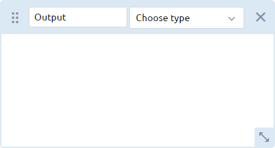
- Enter a label for the output in the text box.
-
Select the type of the output from the Choose type drop-down list. Depending on the type of data you want to visualize, select the appropriate option:
- To view a two-dimensional series data set, select Plot, Time plot, Time stack chart, or Time color chart.
-
To view histogram data, select Histogram.
- To view the data from a collection of two-dimensional histograms, select Histogram 2D.
- To view single values using a text label, select Single value.
-
To view multiple single values for comparison, select Stack chart, Bar chart, or Pie chart.
If you are planning to run an optimization experiment, consider adding one of these charts to display the optimized input values by adding appropriate inputs as its data items.
To use certain output types, you must ensure that your model contains the appropriate data analysis elements. For example, to select Histogram as the output type, your model should contain the Histogram data element.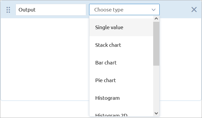
-
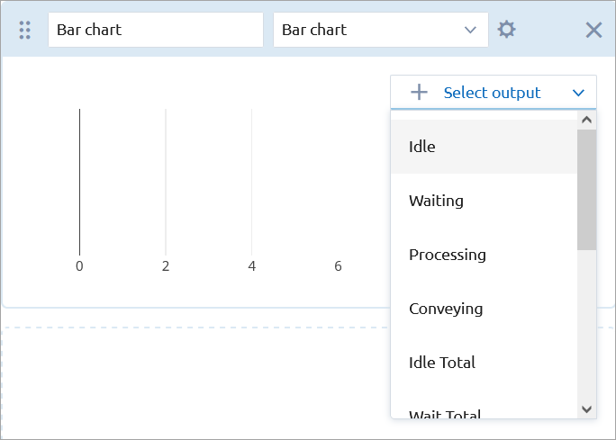
Click Select output inside the chart template and choose the desired model output value from the drop-down list to serve as the data item. The set of available data items depends on the type of the output element that you have selected:
-
Customize the output as needed:
-
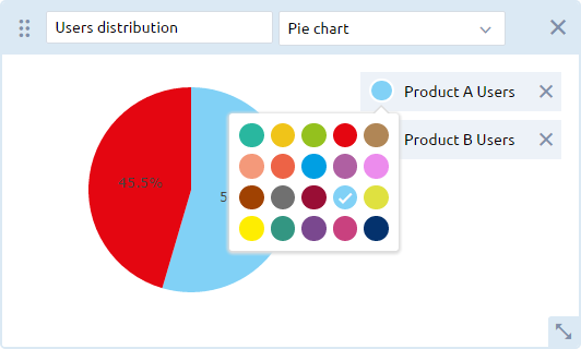
To change the color of the chart’s data element, click the circle next to the data element and select the desired color from the drop-down menu:
-
To move an element to a new location within the Outputs area, drag it using the
 dragging handle in the upper-left corner of the element.
-
To resize an element, drag the
 arrow in the lower right corner of the element.
-
To change the color of the chart’s data element, click the circle next to the data element and select the desired color from the drop-down menu:
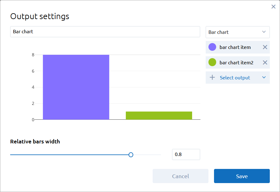
To access the chart settings, add a new output chart, and then click the ![]() icon next to the Choose type drop-down list.
icon next to the Choose type drop-down list.
When exporting the model from AnyLogic desktop installation, its own charts (if any) will be converted to Cloud-specific charts. For reference, see the descriptions of individual charts below.
The charts described in this section can be added for simulation (single-run) experiments and optimization experiments.
- Plot
-
The plot is equivalent to the Plot element of AnyLogic.
The following output elements of AnyLogic can be converted to the plot in AnyLogic Cloud: data sets and data sets with time as the horizontal value, plot dataset items, Time plot, Time stack chart, and Time color chart.
Interpolation — Defines the interpolation of the plot, that is, what values the plot takes between two adjacent data set points:
Linear — Two adjacent data set points are connected with a straight-line segment.
Step — The Y value between two adjacent data points is the same as in the point with the less X value.Vertical scale type — Choose the type of scale for the Y axis:
Auto — The auto-scaling mode.
Fixed — The minimum and maximum values: specify them in the Vertical scale range controls.Horizontal scale type — Choose the type of scale for the X axis:
Auto — The auto-scaling mode.
Fixed — The minimum and maximum values: specify them in the Horizontal scale range controls.Select output — Select the model output value as a data item of the plot.
- Time plot
-
The time plot is equivalent to the Time plot element of AnyLogic.
The following output elements of AnyLogic can be converted to the time plot in AnyLogic Cloud: data sets and data sets with time as the horizontal value, plot dataset items, Time plot, Time stack chart, and Time color chart.
Time axis format — Select how the model time should be displayed on the X axis:
Model time units (units) — Display time in the defined model time units, with units showing the units used.
Date and time — Display the full date and time (for example, Jan 21, 2009 11:00:04 PM).
Date — Display date only (for example, Jan 21, 2009).
Time — Display time only (for example, 11:00:04 PM).
Milliseconds — Display time in milliseconds.
Seconds — Display time in seconds.
Minutes — Display time in minutes.
Hours — Display time in hours.
Days — Display time in days.
Weeks — Display time in weeks.
Months — Display time in months.
Years — Display time in years.Interpolation — Defines the interpolation of the plot, that is, what values the plot takes between two adjacent data set points:
Linear — Two adjacent data set points are connected with a straight-line segment.
Step — The Y value between two adjacent data points is the same as in the point with the less X value.Vertical scale type — Choose the type of scale for the Y axis:
Auto — The auto-scaling mode.
Fixed — The minimum and maximum values: specify them in the Vertical scale range controls.Fill area under the line — If selected, the area under the line will be filled with the line color.
Time window — Specify the length and the time units of the time axis.
Select output — Select the model output value as a data item of the plot.
- Time stack chart
-
The time stack chart is equivalent to the Time stack chart element of AnyLogic.
The following output elements of AnyLogic can be converted to the time stack chart in AnyLogic Cloud: data sets and data sets with time as the horizontal value, plot dataset items, Time plot, Time stack chart, and Time color chart.
Time axis format — Select how the model time should be displayed on the X axis:
Model time units (units) — Display time in the defined model time units, with units showing the units used.
Date and time — Display the full date and time (for example, Jan 21, 2009 11:00:04 PM).
Date — Display date only (for example, Jan 21, 2009).
Time — Display time only (for example, 11:00:04 PM).
Milliseconds — Display time in milliseconds.
Seconds — Display time in seconds.
Minutes — Display time in minutes.
Hours — Display time in hours.
Days — Display time in days.
Weeks — Display time in weeks.
Months — Display time in months.
Years — Display time in years.Vertical scale type — Choose the type of scale for the Y axis:
Auto — The auto-scaling mode.
Fixed — The minimum and maximum values: specify them in the Vertical scale range controls.
100% — The scale range equals 100%.Time window — Specify the length and the time units of the time axis.
Select output — Select the model output value as a data item of the plot.
- Time color chart
-
The time color chart is equivalent to the Time color chart element of AnyLogic.
The following output elements of AnyLogic can be converted to the time color chart in AnyLogic Cloud: data sets and data sets with time as the horizontal value, plot dataset items, Time plot, Time stack chart, and Time color chart.
Time axis format — Select how the model time should be displayed on the X axis:
Model time units (units) — Display time in the defined model time units, with units showing the units used.
Date and time — Display the full date and time (for example, Jan 21, 2009 11:00:04 PM).
Date — Display date only (for example, Jan 21, 2009).
Time — Display time only (for example, 11:00:04 PM).
Milliseconds — Display time in milliseconds.
Seconds — Display time in seconds.
Minutes — Display time in minutes.
Hours — Display time in hours.
Days — Display time in days.
Weeks — Display time in weeks.
Months — Display time in months.
Years — Display time in years.Color mapping — Assign colors to values that satisfy specific conditions.
To change a color, click its color swatch to the left and select a new color from the available options.
To add a new value to the time color chart, click Add value, specify the new value and condition, and select a color.
Starting with version 2.7.2, AnyLogic Cloud allows you to enter custom names for the colored sections of the charts. These names will appear in the chart legend after the experiment has been run.Time window — Specify the length and the time units of the time axis.
- Histogram
-
The histogram is equivalent to the Histogram element of AnyLogic.
The following output elements of AnyLogic can be converted to the histogram in AnyLogic Cloud: Histogram, Histogram data.
Show PDF — The probability distribution function is displayed in the form of vertical bars. Each bar represents an interval where the height is proportional to the number of data set points within the interval.
Show CDF — The cumulative distribution function will be displayed as a polyline above the vertical bars.
Show mean — The mean is displayed as a vertical line at the corresponding value axis position.
Relative bars width — Adjust the width of a bar.
Select output — Select the model output value as the data element of the plot.
- Histogram 2D
-
The histogram 2D is equivalent to the Histogram 2D element of AnyLogic.
The following output elements of AnyLogic can be converted to the histogram in AnyLogic Cloud: Histogram, Histogram 2D data.
Show envelopes — Histogram data is displayed as envelopes: the areas containing a given percentage of data in each simple histogram. You can specify a comma-separated list of lower bounds for the resulting envelopes.
Show bins — Histogram data is displayed as bins.
Select output — Select the model output value as the data element of the plot.
- Stack chart
-
The stack chart is equivalent to the Stack chart element of AnyLogic.
The following output elements of AnyLogic can be converted to the stack chart in AnyLogic Cloud: simple int and double values, values in different units, Bar chart, Stack chart, and Pie chart.
Select output — Select the model output value as the data element of the plot.
- Bar chart
-
The bar chart is equivalent to the Bar chart element of AnyLogic.
The following output elements of AnyLogic can be converted to the bar chart in AnyLogic Cloud: simple int and double values, values in different units, Bar chart, Stack chart, and Pie chart.
Relative bars width — Adjust the width of a bar.
Select output — Select the model output value as the data element of the plot.
- Pie chart
-
The pie chart is equivalent to the Pie chart element of AnyLogic.
The following output elements of AnyLogic can be converted to the pie chart in AnyLogic Cloud: simple int and double values, values in different units, Bar chart, Stack chart, and Pie chart.
This section describes the charts available for experiments that require multiple runs. These experiments are Variation, Variation with replications, Monte-Carlo 1st order, Monte-Carlo 2nd order, and Optimization with replications.
- Mean and error plot
-
The mean and error plot shows the mean of the calculated data and how it varies. A single data point represents the mean value, and the error bars represent the margin of error, or the overall distribution of the data. The size of the error bar indicates the confidence level for the calculated mean value; the greater the deviation of the lower and upper edges from the mean point, the less reliable the calculation. In this chart, the error bars are calculated using the standard deviation of the data.
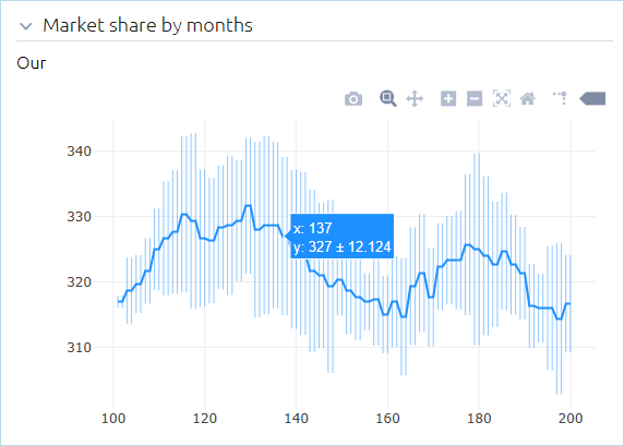
To access the mean and error plot settings, add it on the dashboard, then click the
 icon next to the Choose type drop-down list.
Use time as the X axis format — If selected, the chart is timed. This means when new samples are added to the chart, the Y-value is taken from the output element, while the X-value corresponds to the current model time.
Time axis format (Visible if the Use time as the X axis format option is enabled) — Select how the model time should be displayed on the X axis:
Model time units (units) — Display time in the defined model time units, with units showing the units used.
Date and time — Display the full date and time (for example, Jan 21, 2009 11:00:04 PM).
Date — Display date only (for example, Jan 21, 2009).
Time — Display time only (for example, 11:00:04 PM).
Milliseconds — Display time in milliseconds.
Seconds — Display time in seconds.
Minutes — Display time in minutes.
Hours — Display time in hours.
Days — Display time in days.
Weeks — Display time in weeks.
Months — Display time in months.
Years — Display time in years.The following types of output can be displayed on the mean and error plot: data sets and data sets with time as the horizontal value, plot dataset items, Time plot, Time stack chart, and Time color chart.
- Box plot
-
The box plot shows the probability distribution for data sets in quartiles:
- The bottom of the 1st quartile (q1) corresponds to the 25th percentile (that is, 25% of the total values of this data set will fall below this value)
- The 2nd quartile represents the median value
- The top of the 3rd quartile (q3) corresponds to the 75th percentile
The box plot also displays the following:
- Maximum, minimum, median, and mean values
- Data values that lie outside of the 1st and 3rd quartiles — in the form of vertical segments commonly known as whiskers, that extend to the minimum and maximum values of the distribution
- Outliers, plotted as points
- The upper and lower fences that separate the outliers from the rest of the data
To see the exact values in the above categories, move the mouse pointer over the box plot.
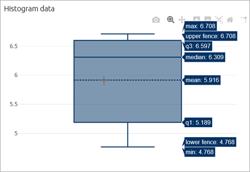
The following types of output can be displayed on the box plot: simple int and double values, values in different units, Bar chart, Stack chart, Time color chart, Histogram, and Histogram data.
- Scatter plot
-
A scatter plot is a 2D or 3D chart that shows the relationship between an independent variable and one or more dependent variables. The value of the independent variable changes according to a specified rule, while the values of the dependent variables are calculated based on the changes in the independent variable. The values are plotted as a collection of individual points, where the value of the independent variable determines the point’s position on the X-axis, and the values of the dependent variables determine its position on the Y-axis.
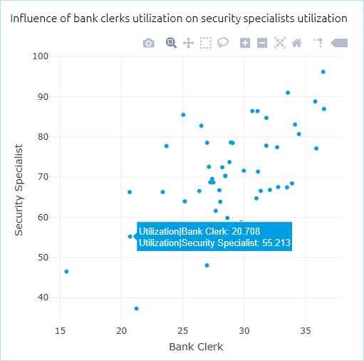
In addition, the scatter plot can display not only points, but also points combined with lines or lines alone. This can be set in the chart settings.
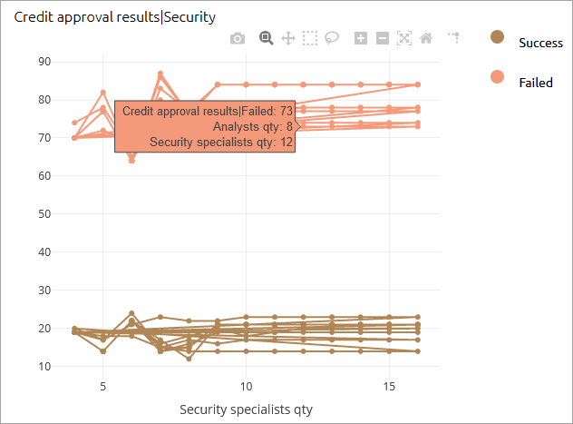
- When setting up a scatter plot you can select any number of outputs (at least one is required) and one input. Optionally, you can create a plot from outputs only.
- When one input or more than 3 outputs are selected, all outputs are plotted on the Y-axis, and the X-axis plots the input value (if it exists) or the output value index (if there is no input).
- If multiple outputs are selected for a particular input, each output will have its own color on the graph. Hovering over a point on the graph shows the current output value and the changing values of the inputs.
The following types of output can be displayed on the scatter plot: simple int and double values, values in different units, Bar chart, Stack chart, and Pie chart.
- Density plot
-
The density plot shows the probability distribution of values in a data set. The values of the data set from each run are plotted on a line along the X-axis, and after multiple runs, the areas of the plot with the highest probability density will overlap. The value along the Y-axis represents the probability density of the corresponding value along the X-axis.
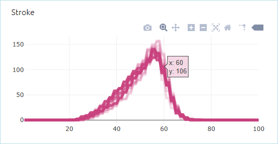
To access the density plot settings, add it on the dashboard, then click the
 icon next to the Choose type drop-down list.
Use time as the X axis format — If selected, the chart is timed. This means when new samples are added to the chart, the Y-value is taken from the output element, while the X-value corresponds to the current model time.
Time axis format (Visible if the Use time as the X axis format option is enabled) — Select how the model time should be displayed on the X axis:
Model time units (units) — Display time in the defined model time units, with units showing the units used.
Date and time — Display the full date and time (for example, Jan 21, 2009 11:00:04 PM).
Date — Display date only (for example, Jan 21, 2009).
Time — Display time only (for example, 11:00:04 PM).
Milliseconds — Display time in milliseconds.
Seconds — Display time in seconds.
Minutes — Display time in minutes.
Hours — Display time in hours.
Days — Display time in days.
Weeks — Display time in weeks.
Months — Display time in months.
Years — Display time in years.The following types of output can be displayed on the density plot: data sets and data sets with time as horizontal value, plot dataset items, Time plot, Time stack chart, and Time color chart.
- Surface plot
-
The surface plot shows the interaction of two varying parameters and how the values of these parameters (X and Y) affect the output value, shown along the Z-axis.
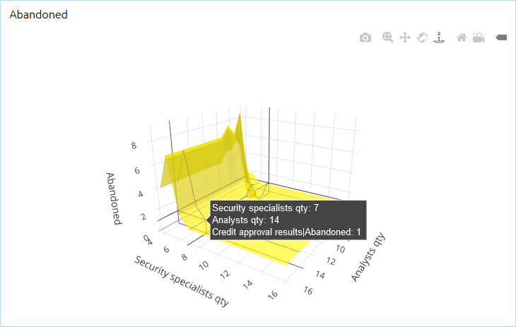
- The surface plot is available for the following types of experiments: Variation and Variation with replications.
- The following types of outputs can be displayed on the surface plot: simple int and double values, values in different units, Bar chart, Stack chart, and Pie chart.
-
How can we improve this article?
-

