

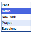
This control displays a list of elements and allows a user to choose one (or several) elements. If certain elements do not fit in the allotted area, you can use the vertical scroll bar on the right to see all the elements of the list.
You can link this control to a variable or a parameter of type String. In this case when the user chooses another element from the list box, the linked variable or parameter immediately takes element’s name as its value.
To add a list box
- Drag the
 List Box element from the
  Controls palette into the graphical editor.
 - Navigate to the Properties view.
- If you want to bind the list box with a variable or a parameter of type String (on changing the value of the list box, the linked variable/parameter immediately gets this value), you should select the Link to checkbox and choose the name of the parameter from the drop-down list to the right. You can also easily link a control to a parameter of a flowchart block. To learn more about linking controls to parameters, see Linking controls to parameters.
- You can also define any action to be executed each time the value of the list box is changed. Type the code you want to execute in this case into the Action section (the current value of the list box is available here as value (String variable, holding the label of the currently selected item)).
- General
-
Name — The name of the list box. It is used to identify and access the control from code.
Ignore — If selected, the list box will be excluded from the model.
Visible on upper agent — If selected, the control will be also visible on the upper agent where this agent lives.
Multiple selection — [Enabled if the Link to checkbox is not selected] If selected, a user will be allowed to select multiple items at the same time.
Items — The table defining items that will appear in the list box.
To remove an item, select the corresponding row in the table and click the “cross” button. Items can be rearranged using the buttons below the table.Link to — If you want to bind the list box with a variable or a parameter of type String (on choosing another element from the list box, the linked variable/parameter immediately gets element’s name as its value), select this checkbox and enter the name of the variable or parameter you want to link to the list box.
Default value — [Visible if the Link to checkbox is not selected] Expression evaluating String name of the item that will be chosen in the list box by default.
For instance, your list box has Items called red and green. To make green selected by default, type here the item name in inverted commas:
"green"Enabled — Here you can specify Boolean expression determining whether the list box is enabled or disabled.
- Action
-
Here you can type the code to execute when user selects another item of the list box. The currently selected item is available here as value (String variable, holding the label of the item).
- Appearance
-
Background color — The control specifies the background color for the list box. Click inside the control and choose a color from the set of most used ones, or choose some custom color using the Colors dialog box.
Text color — The control specifies the color of the text displayed inside the list box. Click inside the control and choose a color from the set of the most used ones, or choose a custom color using the Colors dialog box.
Font — Specifies the font family for the text displayed inside the list box. You can adjust the size of the text In the field to the right (pt.).
Italic — If checked, the text displayed inside the list box will be italicized.
Bold — If checked, the text displayed inside the list box will be emphasized in bold.
- Position and size
-
Level — Level to which this control belongs.
X — X-coordinate of the control’s upper left corner.
Y — Y-coordinate of the control’s upper left corner.
Width — The width of the control (in pixels).
Height — The height of the control (in pixels).
- Advanced
-
Visible — The control’s visibility. The control is visible when the specified expression evaluates to true, otherwise it is not visible.
Replication — Here you specify the number of copies of this control you want to be created. If you leave this field empty, only one such control will be created.
Show name — If selected, the name of the control will be displayed on a presentation diagram.
Icon — If selected, the list box will be considered as a part of the agent’s icon.
- Obtaining the currently selected value(s)
-
Function Description String getValue() Returns the currently selected text item if in single-selection mode, or the first selected text item if in multiple-selection mode.
Returns null if there is no selection.int getValueIndex() Returns the index of the currently selected text item or -1 when there is no selection.
Returns the first selected text item if in multiple-selection mode.String[] getValues() Returns an array of selected text items (for use in multiple-selection mode).
Returns empty array if there is no selection.int[] getValuesIndices() Returns an array of selected items’ indices (for use in multiple-selection mode).
Returns empty array if there is no selection. - Selecting new values
-
Function Description void setValue(String text) Sets the selected text item of the list box.
Clears list box selection if text is null.
Doesn’t execute user action code.
text — the new selected text item or null.void setValue(String text, boolean callAction) Sets the selected text item of the list box. Clears list box selection if text is null. Executes user action code (if there is any), if callAction parameter is true.
text — the new selected text item or null.
callAction — if true, user action code (if there is any) will be executed.void setValueIndex(int valueIndex) Selects the item with the given index.
Clears list box selection if valueIndex is negative.
Doesn’t execute user action code.
valueIndex — the item index.void setValueIndex(int valueIndex, boolean callAction) Selects the item with the given index. Clears list box selection if valueIndex is negative.
Executes user action code (if there is any) if callAction parameter is true.
valueIndex — the item index.
callAction — if true, user action code (if there is any) will be executed.void setValues(String[] texts) Sets the selected text items of the list box (in the multiple-selection mode).
Clears list box selection if texts is null or empty.
Doesn’t execute user action code.
texts — the new selected text items or null.void setValues(String[] texts, boolean callAction) Sets the selected text items of the list box (in the multiple-selection mode).
Clears list box selection if texts is null or empty.
Executes user action code (if there is any) if callAction parameter is true.
texts — the new selected text items or null.
callAction — if true, user action code (if there is any) will be executed.void setValuesIndices(int[] valuesIndices) Selects items with the given indices (in the multiple-selection mode).
Clears list box selection if valuesIndices is null or empty.
Doesn’t execute user action code.
valuesIndices — the item index.void setValuesIndices(int[] valuesIndices, boolean callAction) Selects items with the given indices (in the multiple-selection mode).
Clears list box selection if valuesIndices is null or empty.
Executes user action code (if there is any), if callAction parameter is true.
valuesIndices — the item index.
callAction — if true, user action code (if there is any) will be executed.void setValueToDefault() Sets the text of the list box to what was provided as the default one.
Doesn’t execute user action code. - Enabling and disabling
-
Function Description boolean isEnabled() Tests if the control is enabled or disabled. Returns true if enabled, otherwise false. void setEnabled(boolean yes) Sets the control enabled or disabled.
yes — If true, the control will be enabled, if false — disabled. - Executing the action
-
Function Description void action() Executes the action associated with a list box. - Accessing items
-
Function Description String[] getItems() Returns array of String items currently used in this list box.
The returned array is the same as has been passed to setItems(String[]), and may be null.
The returned array should not be changed by user. - Adding new items
-
Function Description void setItems(String[] items) Sets new items for this list box. This function preserves current list box values if current values are contained in new items. This function doesn’t execute user action code (even if current selection changes).
Provided array is used internally and shouldn’t be changed by user after this function is called.
items — the array of String items to be placed in this list box.void setItems(String[] items, boolean callAction) Sets new items for this list box. This function preserves current list box values if current values are contained in new items. This function doesn’t execute user action code (even if current selection changes).
The provided array is used internally and shouldn’t be changed by user after this function is called.
items — the array of String items to be placed in the combo box drop-down list.
callAction — if true and selection changes, user action code (if there is any) will be executed. - Position
-
Function Description double getX() Returns the X coordinate of the control (namely, the X coordinate of its upper left corner). double getY() Returns the Y coordinate of the control (namely, the Y coordinate of its upper left corner). void setX(double x) Sets the X coordinate of the control.
x — the new value of X coordinate.void setY(double y) Sets the Y coordinate of the control.
y — the new value of Y coordinate.void setPos(double x, double y) Sets new coordinates for the control.
x — the new value of x coordinate.
y — the new value of y coordinate. - Visibility
-
Function Description boolean isVisible() Returns the visibility of the control. void setVisible(boolean v) Sets the visibility of the control.
v — visibility: if true — the control is set to be visible, if false — not visible. - Group
-
Function Description ShapeGroup getGroup() Returns the group containing this control. - Level
-
Function Description Level getLevel() Returns the level, where this control is located.
-
How can we improve this article?
-