


Time color charts display trends across multiple data sets as bars with horizontal stripes color-coded based on data values. The time axis is always horizontal and directed to the right, it shows data within specified time windows. On each chart update (automatic or manual), boolean expressions defined over data items are evaluated. If a condition evaluates to true, the stripe is colored according to that condition; otherwise, the next condition is checked.
This chart type can be used to visualize how an object’s discrete state changes over time, such as busy/idle or traveling/loading/unloading/parked/maintenance.
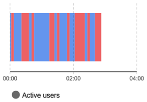 Time color chart
To create a time color chart
- Drag the
 Time Color Chart element from the
  Analysis palette into the graphical editor.
 - In the Data section of the chart’s Properties, add and configure a data item.
- First, select the source of data for this data item — Value or Data set.
- To display how a variable or a parameter changes over time, select the Value option and enter the variable or parameter name in the Value edit box. You can also enter any expression. Expressions are evaluated at the defined recurrence interval, and results are added to the chart.
- To display values collected by a dataset, select the Data set option and enter the dataset name in the Data set edit box.
- Specify the title for each data item in the Title box. This text will be shown in the chart legend.
- Open the Color mapping section of the chart’s Properties and create color mappings.
- Open the Appearance section of the chart’s Properties. In the Time axis format edit box you can choose the format of time axis labels: whether you want Model time units (abstract simulation time: 0, 10, 20, ...) or Model date (real calendar dates in various formats: Jan 21, 2025, 11:00:48 PM; 01/21/2025; 21.01.2025; 21 Jan; ...) to be displayed.
To add a data item
By default, a new time color chart already has two data items. To add another, follow these steps:
- Select the time color chart in the graphical editor or in the Projects view.
- Go to the Data section of the properties.
- Click the
 Add button. A new property section with settings for one more data item will appear below.
To remove a data item
- Select the time color chart in the graphical editor or in the Projects view.
- Go to the Data section of the properties.
- Locate the section defining the data item you want to remove from the time color chart.
- In this section, click the
 button.
You should also define the correspondence of data item values and colors.
To define a color mapping
- Navigate to the Color mapping section of the chart’s properties.
-
Click the
 button. A new property section defining settings for a new color mapping appears above.
-
Configure the color mapping:
- Select the comparison operator (>, ≥, <, ≤, = or ≠) for comparing the Value of the data item with the result of evaluating the expression.
- In the edit box to the right, provide an expression.
- Set the color for the mapping using the Color control. This color will be used to paint the current chart’s data stripe when the condition defined in this color mapping evaluates to true.
If multiple color mappings are specified for the chart, the conditions specified for them are checked in the top-to-bottom sequential order. The first successful verification (i.e., when the specified condition evaluates to true) will determine the color the chart’s data stripe will be painted with. Therefore, by changing the order of the color mapping, you affect the appearance of the chart.
To reorder color mappings
- Navigate to the Color mapping section of the chart’s properties.
-
Select the section defining the color mapping you want to move and use the arrows
 and
and  below to move it up or down in the list.
To remove a color mapping
- In the Color mapping section of the chart’s properties, select the section defining the color mapping you want to remove.
-
Click the
 button below all sections.
- General
-
Name — The name of the chart. The name is used to identify and access the chart from code.
Show name — If selected, the name of the chart is displayed in the presentation diagram.
Lock — If selected, the element is locked; it will not respond to any mouse actions during the model development time. To select the element, click its icon in the Elements view.
Ignore — If selected, the chart is excluded from the model.
- Data
-
Value — [Visible if the Value option is selected above] The expression evaluated to obtain new Y-axis values to be added onto the chart.
Data set — [Visible if the Data set option is selected above] Name of the data set collecting values to display in this chart.
Title — Data item name to be shown in the chart legend.
The
and arrows — Allow you to rearrange the data items.The
button — Allows you to remove data items from the chart.The
Add button — Creates a section for a new data item. - Color mapping
-
Add — Creates a section for a new color mapping rule based on a condition.
Condition drop-down menu — Allows you to select the comparison operator (>, ≥, &, <, ≤, = or ≠) for the condition.
Value box — Allows you to enter a code expression to be evaluated.
Color — The color applied to the bar when the condition evaluates to true.
The
and arrows — Allow you to rearrange the data items.The
button — Allows you to remove data items from the chart.Default color — The color applied when none of the conditions are met.
Each condition compares the current data item value (from the Data section) with the expression result. When true, the corresponding Color is applied to the chart bar.
If multiple conditions are specified, they are evaluated from top to bottom. The first condition that evaluates to true determines the bar color.
Expressions are evaluated once at model start and return the same fixed value throughout the model run.
- Data update
-
Update data automatically — If selected, new data samples will be added automatically.
Use model time — [Visible if Update data automatically is selected] If selected, the event will occur at the specified model time.
Use calendar date — [Visible if Update data automatically is selected] If selected, the event will occur at the specified calendar date.
First update time — [Visible if Update data automatically and Use model time are selected] The time of the first update defined as a number of model time units that must pass from the model start.
Update date — [Visible if Update data automatically and Use calendar dates are selected] The calendar date and time of the event.
Recurrence time — [Visible if Update data automatically is selected] The time that must pass between recurring updates.
Maximum number of samples (applies to ‘Value’ data) — The “tail size” of the data set. Defines the number of the latest data items this plot will keep.
- Scale
-
Time window — The time horizon displayed by the chart.
Time window moves — Specifies whether the time window moves according to the current model time (Continuously) or it moves only when a new data point is added to the chart (As data becomes available).
- Appearance
-
Bars relative width — Specifies the bar size as a ratio of the desired bar size to the maximum possible width of a bar in this chart (1 stands for 1:1, 0.5 stands for 1:2, and so on).
Horizontal axis labels — Specifies the position of the horizontal axis labels relative to the chart:
None — No labels will be displayed
Below
AboveTime axis format — The the time axis format to display: Model time units (0, 10, 20, …) or Model date (various date formats).
Style — Click to access extra appearance settings and then click each control to adjust them using the color picker.
Background color — The background color for the entire area allocated for the element. The background color for the chart area can be adjusted later in the Chart area section.
Border color — The color of the element border.
Labels color — The color of the chart labels.
Grid color — The color of the chart grid. Select no color if you do not want the grid to be displayed. - Position and size
-
Level — The level this chart belongs to.
X — The X-coordinate of the element’s upper left corner.
Y — The Y-coordinate of the element’s upper left corner.
Width — The width of the element (in pixels).
Height — The height of the element (in pixels).
- Legend
-
Show legend — If selected, the chart legend is displayed.
Area size — [Enabled if Show legend is selected] Controls the size of the legend area (between the element border and the divider): width for Below/Above legend position or height for Left/Right position.
Text color — [Enabled if Show legend is selected] The color that will be used to display the legend. Click the control to adjust the settings using the color picker.
Position — [Enabled if Show legend is selected] Controls the legend position relative to the chart.
- Chart area
-
This section defines the visual properties of the chart area.
X Offset — The horizontal offset of the chart area from the left edge of the element.
Y Offset — The vertical offset of the chart area from the left edge of the element.
Width — The width of the chart area (in pixels).
Height — The height of the chart area (in pixels).
Style — Click to access extra appearance settings and then click each control to adjust them using the color picker.
Background color — The chart area background color.
Border color — The color of the chart area border. - Actions
-
On selection change — The code executed when the user selects particular data items. This code is executed either when the user changes the selection by clicking on items in the chart legend, or when the selection is changed programmatically by selectItem().
You can use the following variables:
- int[] selectedIndices — returns the indices of currently selected data items
- boolean programmatically — defines whether items were selected programmatically (true) or not (false)
- Visibility
-
Visible — Toggles the visibility of the element. The chart is visible when the box is checked or when the specified expression evaluates to true, and not visible otherwise.
Agent presentation — If selected, the chart is included in the agent presentation. This means that if the agent hosting this control is embedded in another agent, the control will remain visible.
- Expert
-
Replication — The replication factor of the chart. Here you can specify how many copies of the chart will be created. If you leave this box empty, only one chart will be created.
- Data items
-
Function Description void addDataSet(DataSet ds) Adds a data set to the chart with default title "Data set".
ds — the data set to addvoid addDataSet(DataSet ds, String title) Adds a DataSet with the specified title.
ds — the data set to add
title — the data set’s title
int getCount() Returns the number of chart items (data items or data sets) currently displayed by this chart. ChartItem get(int i) Returns the chart item (DataItem, DataSet, etc.) with the given index. String getTitle(int i) Returns the title of chart item (DataItem, DataSet, etc.) with the given index. void remove(int i) Removes the item (DataItem, DataSet, etc.) with the given index from the chart. int remove(ChartItem ci) Removes the given item (DataItem, DataSet) from the chart. void removeAll() Removes all items from the chart. - Selecting data items
-
Function Description void selectItem(int itemIndex, boolean selected) Selects/deselects (depending on selected value) the chart item with given index. void setSelectedItemIndices(int[] selectedIndices) Selects only chart items with the given indices.
selectedIndices — an array with indices of chart items to be selected (other chart items will be deselected), may be null — this clears selectionint[] getSelectedItemIndices() Returns the number of currently selected chart items (data items or data sets). - Updating chart data manually
-
Function Description void updateData() Updates all data items displayed by this chart. - Location
-
Function Description double getX() Returns the X-coordinate of the element (upper left corner). double getY() Returns the Y-coordinate of the element (upper left corner). void setX(double x) Sets the X-coordinate of the element.
x — the new value of X-coordinatevoid setY(double y) Sets the Y-coordinate of the element.
y — the new value of Y-coordinatevoid setPos(double x, double y) Sets new coordinates for the element.
x — the new value of x coordinate
y — the new value of y coordinate - Size
-
Function Description double getWidth() Returns the width of the element. double getHeight() Returns the height of the element. void setWidth(double w) Sets new width for the element.
w — new value of the chart widthvoid setHeight(double h) Sets new height for the element.
h — new value of the chart height - Visibility
-
Function Description boolean isVisible() Checks the visibility of the element. Returns true if the element is visible, and false otherwise. void setVisible(boolean v) Sets the visibility of the element.
v — visibility: if true — the chart is set to be visible, if false — not visible. - Copying chart data to clipboard
-
Function Description String copyToClipboard() Copies all chart data to the system clipboard in the form of a tab-separated table with linear interpolation of values where needed. The table is limited to 1000 values. Returns the text representation of all chart data.
-
How can we improve this article?
-