


Stack charts display the cumulative contribution of multiple data items to a total as stacked bars, with the first added data item at the bottom. The bar sizes are proportional to the corresponding data item values. Negative values are not supported, and an error will be thrown if you attempt to provide a negative data item value.
Stack growth direction and stack width can be adjusted in the Appearance section of the chart’s properties: Bars direction and Bars relative width correspondingly.
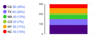 Stack chart
To create a stack chart
- Drag the
 Stack Chart element from the
  Analysis palette into the graphical editor.
 - In the Data section of the chart’s properties, configure the first data item.
- Enter the expression that will be dynamically evaluated to obtain the current value of the data item in the Value box.
- Specify the name for the data item in the Title box. This text will be shown in the chart legend.
- Specify the color for this data item’s bar. Click the control to use the color picker.
- Open the Appearance section of the chart’s properties. Adjust the bar growth direction using the Bars direction button group.
- The chart can be displayed as a group of distinct bars of arbitrary thickness or as a continuous stack. To adjust the bar size, use the Bars relative width edit box: here you can define the ratio of the bar width to the chart area width (1 for 100%, 0.5 for 50%, etc.)
When finished, specify additional data items you want to be displayed in your chart.
To add a data item
By default, a new stack chart already has one data item. To add another, follow these steps:
- Select the stack chart in the graphical editor or in the Projects view.
- Go to the Data section of the properties.
- Click the
 Add button. A new property section with settings for one more data item will appear below.
To remove a data item
- Select the stack chart in the graphical editor or in the Projects view.
- Go to the Data section of the properties.
- Locate the section defining the data item you want to remove from the stack chart.
- In this section, click the
 button.
- General
-
Name — The name of the chart. Used to identify and access the chart from code.
Show name — If selected, the name of the chart is displayed in the presentation diagram.
Lock — If selected, the chart is locked; it will not respond to any mouse actions during the model development time. To select the element, click its icon in the elements view.
Ignore — If selected, the chart is excluded from the model.
- Data
-
Value — The expression dynamically evaluating the data item value.
Title — The title for this data item which will be shown in the chart legend.
Color — The color that will be used to display this data item value in the chart. Click the control to use the color picker.
The
 and
and  arrows — Allow you to rearrange the data items.
The
button — Allows you to remove data items from the chart.The
Add button — Creates a section for a new data item. - Data update
-
Update data automatically — If selected, new data samples will be added automatically.
Use model time — [Visible if Update data automatically is selected] If selected, the event will occur at the specified model time.
Use calendar date — [Visible if Update data automatically is selected] If selected, the event will occur at the specified calendar date.
First update time — [Visible if Update data automatically and Use model time are selected] The time of the first update defined as a number of model time units that must pass from the model start.
Update date — [Visible if Update data automatically and Use calendar dates are selected] The calendar date and time of the event.
Recurrence time — [Visible if Update data automatically is selected] The time that must pass between recurring updates.
- Scale
-
Scale — Specifies the scaling type for your chart:
Auto mode reserves a Y-axis offset within the chart area
Fixed mode allows you to define a maximum Y-axis value for the chart area using either a static or dynamic value in the To edit box
100% mode scales the chart area to match the chart’s maximum Y-value - Appearance
-
Bars direction — The group of buttons defining the bar growth direction:
Up
Right
Down
LeftBars relative width — Specifies the bar size as a ratio of the desired bar size to the maximum possible width of a bar in this chart (1 stands for 1:1, 0.5 stands for 1:2, and so on).
Axis labels position — Specifies the position of the axis labels relative to the chart.
None — No labels will be displayed
Left
RightStyle — Click to access extra appearance settings and then click each control to adjust them using the color picker.
Background color — The background color for the entire area allocated for the element. Click the control to adjust it using the color picker. The background color for the chart area can be adjusted later in the Chart area section.
Border color — The color of the outer border of the element.
Labels color — The color of the Y-axis labels.
Grid color — The color of the grid inside the chart area. - Position and size
-
Level — The level this chart belongs to.
X — The X-coordinate of the element’s upper left corner.
Y — The Y-coordinate of the element’s upper left corner.
Width — The width of the element (in pixels).
Height — The height of the element (in pixels).
- Legend
-
Show legend — If selected, the chart legend is displayed.
Text color — [Enabled if Show legend is selected] The color that will be used to display the legend. Click the control to adjust the settings using the color picker.
Area size — [Enabled if Show legend is selected] Controls the size of the legend area (between the element border and the divider): width for Below/Above legend position or height for Left/Right position.
Position — [Enabled if Show legend is selected] Controls the legend position relative to the chart.
- Chart area
-
This section defines the visual properties of the chart area.
X Offset — The horizontal offset of the chart area from the left edge of the element.
Y Offset — The vertical offset of the chart area from the left edge of the element.
Width — The width of the chart area (in pixels).
Height — The height of the chart area (in pixels).
Style — Click to access extra appearance settings and then click each control to adjust them using the color picker.
Background color — The chart area background color.
Border color — The color of the chart area border. - Actions
-
On selection change — The code executed when the user selects particular data items. This code is executed either when the user changes the selection by clicking on items in the chart legend, or when the selection is changed programmatically by selectItem().
You can use the following variables:
- int[] selectedIndices — returns the indices of currently selected data items
- boolean programmatically — defines whether items were selected programmatically (true) or not (false)
- Visibility
-
Visible — Toggles the visibility of the element. The chart is visible when the box is checked or when the specified expression evaluates to true, and not visible otherwise.
Agent presentation — If selected, the chart is included in the agent presentation. This means that if the agent hosting this control is embedded in another agent, the control will remain visible.
- Expert
-
Replication — The replication factor of the chart. Here you can specify how many copies of the chart will be created. If you leave this box empty, only one chart will be created.
- Data items
-
Function Description void addDataItem(DataItem di) Adds a DataItem to the chart with default title and color.
di — the data item to addvoid addDataItem(DataItem di, String title, Color color) Adds a data item to the chart.
di the data item to add
title — the data item title
color — the color that will be associated with this data itemint getCount() Returns the number of chart items (data items or data sets) currently displayed by this chart. ChartItem get(int i) Returns the chart item (DataItem, DataSet, HistogramData, etc.) with the given index. String getTitle(int i) Returns the title of chart item (DataItem, DataSet, etc.) with the given index. Color getColor(int i) Returns the color of the chart item (DataItem, DataSet) with the given index.
i — index of the itemvoid setColor(int i, Color c) Sets the new color of the chart item (DataItem, DataSet) with the given index.
i — index of the item;
c — the new color of the item.void remove(int i) Removes the item (DataItem, DataSet, etc.) with the given index from the chart. int remove(ChartItem ci) Removes the given item (DataItem, DataSet) from the chart. void removeAll() Removes all items from the chart. - Selecting data items
-
Function Description void selectItem(int itemIndex, boolean selected) Selects/deselects (depending on selected value) the chart item with given index. void setSelectedItemIndices(int[] selectedIndices) Selects only chart items with the given indices.
selectedIndices — an array with indices of chart items to be selected (other chart items will be deselected), may be null — this clears selectionint[] getSelectedItemIndices() Returns the number of chart items (data items or data sets) currently displayed by this chart. - Setting chart’s axis scale
-
Function Description void setFixedScale(double maximum) Sets fixed scale for the chart
maximum — maximum of chart axis scale - Updating chart data manually
-
Function Description void updateData() Updates all data items displayed by this chart. - Location
-
Function Description double getX() Returns the X-coordinate of the element (upper left corner). double getY() Returns the Y-coordinate of the element (upper left corner). void setX(double x) Sets the X-coordinate of the element.
x — the new value of X-coordinatevoid setY(double y) Sets the Y-coordinate of the element.
y — the new value of Y-coordinatevoid setPos(double x, double y) Sets new coordinates for the element.
x — the new value of x coordinate
y — the new value of y coordinate - Size
-
Function Description double getWidth() Returns the width of the element. double getHeight() Returns the height of the element. void setWidth(double w) Sets new width for the element.
w — new value of the chart widthvoid setHeight(double h) Sets new height for the element.
h — new value of the chart height - Visibility
-
Function Description boolean isVisible() Checks the visibility of the element. Returns true if the element is visible, and false otherwise. void setVisible(boolean v) Sets the visibility of the element.
v — visibility: if true — the chart is set to be visible, if false — not visible. - Copying chart data to clipboard
-
Function Description String copyToClipboard() Copies all chart data to the system clipboard in text form. Returns the text representation of all chart data.
-
How can we improve this article?
-