


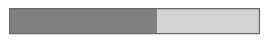
This is an animated rectangle that shows how much of the task is completed. You can define if and how to display the actual percentage if it is available.
Progress bars have two modes:
- The determinate mode gives you an estimate of the task progress. It requires respective data.
- The indeterminate mode provides a bar with a looped animation, showing that a task is in progress, but it is not known how long it will take.
To add a progress bar
- Drag the
 Progress Bar element from the Controls palette into the graphical editor.
 - If you want to use determinate mode, make sure the Determined check box is selected and enter your code into the Progress value field.
- General
-
Name — The name of the progress bar. It is used to identify and access the control from code.
Show name — If selected, the progress bar name is shown next to the element.
Lock — Specifies if the progress bar is fixed on the canvas. You cannot move or select a locked element in the graphical editor.
Ignore — If selected, the progress bar is excluded from the model.
Determined — This control works as a check box or as a field for a Boolean expression. It defines whether the progress bar mode is determinate (true) or indeterminate (false).
Minimum value — The minimum progress value. This field is only visible in determinate mode.
Maximum value — The maximum progress value. This field is only visible in determinate mode.
Progress value — A double-resulting expression that reflects the progress.
Action — Here you can type the code to execute along with the task linked to the progress bar. The current value of the progress bar is available here as a local String variable named value.
- Appearance
-
Label — If you want the progress bar to have text in it (for example, the current progress value), enter a String expression. Two local variables are available here: value reflects the progress value and percent reflects the percentage.
An example:
percent + " % completed"Orientation — The progress bar can be either Horizontal or Vertical.
- Position and size
-
Level — The level this control belongs to.
X — The X-coordinate of the control’s upper left corner.
Y — The Y-coordinate of the control’s upper left corner.
Width — The width of the control (in pixels).
Height — The height of the control (in pixels).
- Visibility and presentation
-
Visible — If selected, the progress bar is shown during runtime. To introduce a dynamic value, click the button and enter the code in the input field. The control will be visible when the specified expression evaluates to true.
Agent presentation — If selected, the control is included in the agent presentation. This means that if the agent hosting this control is embedded in another agent, the control will remain visible.
Agent icon — If selected, the progress bar will be considered a part of the agent’s icon.
- Expert
-
Replication — The number of copies of this control that you want created. If this field is left empty, only one control will be created. This field can be set to a dynamic expression.
- Value
-
Function Description double getValue() Returns the current value of the progress bar. int getPercent() Returns the progress percentage as an integer between 0 and 100. void setValue(double val) Assigns a value to the progress bar.
val — the new value. - Value range
-
Function Description double getMin() Returns the minimum value of the progress bar. double getMax() Returns the maximum value of the progress bar. void setRange(double min, double max) Assigns the minimum and maximum values to the progress bar.
min — the new minimum value.
max — the new maximum value. - Determinate mode
-
Function Description void setDeterminate(boolean val) Defines if the progress bar mode is determinate (true) or indeterminate (false). The determinate mode gives you an estimate of the task progress. The indeterminate mode provides a bar with a looped animation, showing that a task is in progress, but it is not known how long it will take. By default, this property is true.
val — if true, the progress bar works in determinate mode, if false, the mode is set to indeterminate. - Label
-
Function Description void setProgressString(String val) Assigns a String value to be shown inside the progress bar.
val — the new value or null to remove the label. - Position
-
Function Description double getX() Returns the X-coordinate of the control (upper left corner).
double getY() Returns the Y-coordinate of the control (upper left corner).
void setX(double x) Assigns the X-coordinate to the control (upper left corner).
x — the new X-coordinate value.void setY(double y) Assigns the Y-coordinate to the control (upper left corner).
y — the new Y-coordinate value.void setPos(double x, double y) Assigns new coordinates to the control (upper left corner).
x — the new X-coordinate value.
y — the new Y-coordinate value. - Size
-
Function Description double getWidth() Returns the width of the control in pixels. double getHeight() Returns the height of the control in pixels. void setWidth(double width) Assigns width as the width of the control in pixels. void setHeight(double height) Assigns height as the height of the control in pixels. - Visibility
-
Function Description boolean isVisible() Returns the visibility of the control. void setVisible(boolean v) Sets the visibility of the control.
v — visibility: if true, the control is set to be visible, if false, it is not.
- Group
-
Function Description ShapeGroup getGroup() Returns the group containing this control. - Level
-
Function Description Level getLevel() Returns the level on which this control is located.
-
How can we improve this article?
-