Let us focus on oil consumption; we will add oil reordering later.
Although in reality oil consumption occurs in portions (per car) and has some daily and weekly patterns, for the sake of our model we will assume it is at a constant rate: we have not been given any other details (and given the scale of the model we do not need them). A very simple flowchart of Fluid library blocks can easily handle this.
For the purposes of this tutorial, we will assume that each station consumes oil at a constant rate. However, the rate at which they do so varies from station to station using the distribution uniform(0.2,0.8). The initial amount of oil at a station also varies, distributed as uniform(5,20).
We will be using basic Fluid library blocks to model the behavior of the oil change station.
To compose a flowchart
-
Switch to the
OilChangeStation agent type by clicking the appropriate tab name.
-
Open the
Fluid library palette by clicking its icon in the palette view.
-
Drag and drop the following blocks onto the diagram, as shown on the figure below:
Tank,
Valve,
Fluid Dispose.
When you drag a block to the right of another block, they connect automatically. You can also connect ports manually by clicking on them.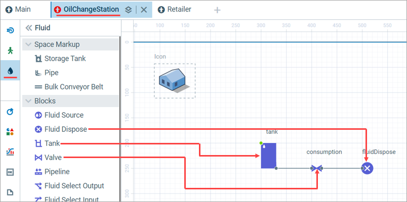
-
Name the blocks and set up their properties:
-
Tank:
Name: tank
Capacity: 20
Initial amount: uniform(5,20) -
Valve:
Name: consumption
Rate when open: uniform(0.2, 0.8)
-
Tank:
Next, we will animate the amount of oil available at the oil change station.
To create the animation
-
Open the
Presentation palette.
-
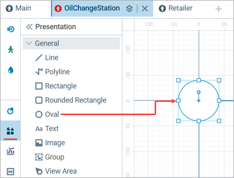
Drag the
Oval markup shape to the coordinate origin of the OilChangeStation graphical diagram.
-
In the properties of the shape, set the oval’s Radius X to 5.

-
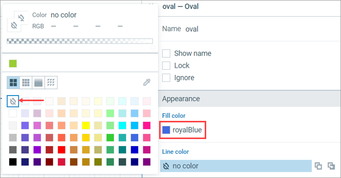
Set Line color to No color and Fill color to royalBlue.
-
Click the icon next to the Fill color to display its dynamic value and set it to the following:
tank.amount() > 5 ? royalBlue : tank.amount() > 0 ? peru : red
When the model runs and the animation is displayed, the color of the oval is dynamically recalculated and changes according to this expression.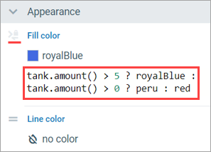
Next we will make some adjustments to the visibility of our agent population on the Main agent.
To customize the animation of the agent population
-
Switch to the
Main agent type and select the oilChangeStations population we created earlier.

-
In the Expert section of its properties, enable the Show presentation option.
The presentation (the oval shape we added earlier) will appear at (0,0). -
From the
Presentation palette, drag and drop the
Group element to approximately the following coordinates: (50, 300).
You can manually enter the coordinates in the Position and size section of the properties. -
Right-click the oval: the presentation of the population that appeared at 0,0 after step 2. Then, select Grouping > Add to Existing Group > group from the context menu.
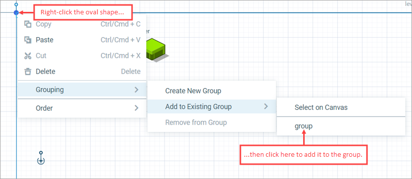
This will cause the station animations to appear with the offset relative to this group.
To ensure that the animation is displayed correctly, we need to do a few more things. This is not a part of the model logic and will not (in our case) affect the behavior of the model. We are just doing it for visualization purposes.
-
In the
Main agent type, click any empty space on the graphical diagram to clear any selection. The Main agent type’s properties will appear.
- Go to the Space and network section of the properties and set Layout type to Random.
-
Set the Space dimensions to 250x250 — Width: 250, Height: 250.
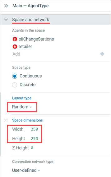
You are ready to run the model for the first time.
To run the model
-
Click
Play on the toolbar to run the animated simulation in the dialog.
-
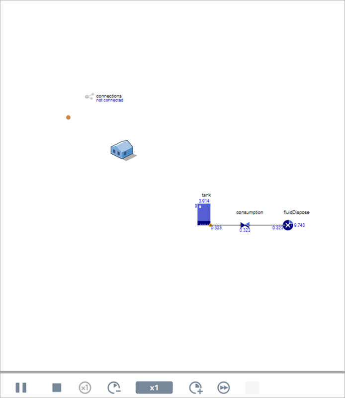
After the model starts, watch the stations change color as they run out of oil.
You can also open the developer panel: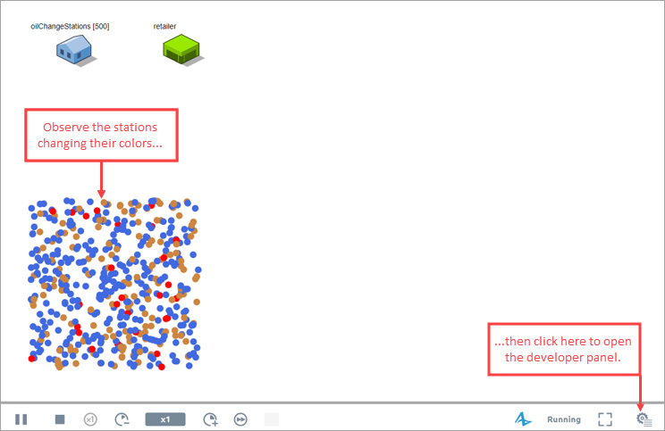
From there you can dive into the population of oilChangeStations and see what happens there as well.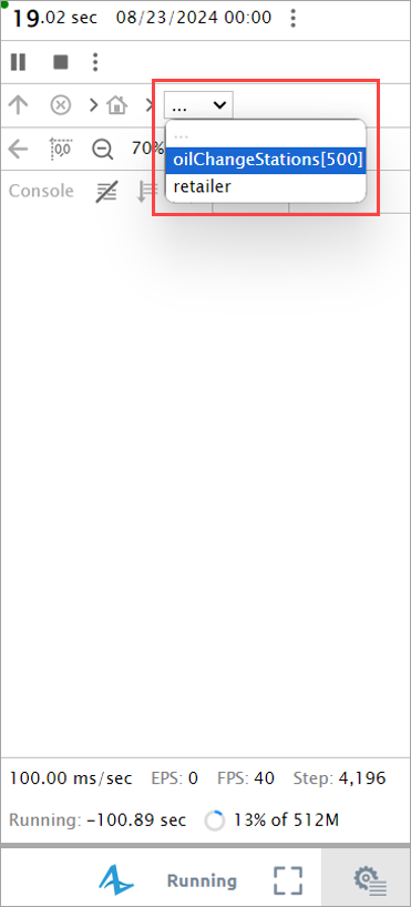
-
How can we improve this article?
-


