


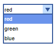
A combo box combines an editable field with a drop-down list. A user can select a value from the drop-down list and, if you make the combo box editable, it will include an editable field into which the user can type new values that are not present in the control by default.
You can link this control to a variable or a parameter of the following types: String, double, and int. This way, when you select an element from the combo box, the linked variable or parameter immediately receives the element’s name as its value.
If you want to enable selection for multiple items simultaneously, use the list box control.
To understand how to work with a combo box, study the given demo model. You will find the code handling the value of the new control in the Action property of the combo box. Demo model: Combo Box Controls Simulation Speed Open the model page in AnyLogic Cloud. There you can run the model or download it (by clicking Model source files). Demo model: Combo Box Controls Simulation SpeedOpen the model in your AnyLogic desktop installation.
To add a combo box
- Drag the
 Combo Box element from the
  Controls palette into the graphical editor.
 - Navigate to the Properties view.
- You can connect the combo box to a variable or a parameter of the following types: String, double, or int. This way, when changing the value of the combo box, the linked parameter or variable wll immediately receive this value. To link the control to a parameter, select the name of the parameter from the Link to drop-down list. To learn more about linking controls to parameters, see Linking controls to parameters.
- You can also define an action to execute each time the value of the combo box changes. Type the code you want to execute into the Action property. The current value of the combo box is available here as value, a String variable that holds the label of the currently selected item.
- General
-
Name — The name of the combo box. It is used to identify and access the control from code.
Show name — If selected, the name of the combo box is displayed in the presentation diagram.
Lock — If selected, the combo box is locked; it will not respond to any mouse actions during the model development time. To select it, click its icon in the elements view.
Ignore — If selected, the combo box is excluded from the model.
Editable — If selected, users can specify values not present in the drop-down list.
Items — The list of items that will appear as the combo box elements.
To remove an entry, hover the mouse pointer over the row in the table and click to the right. Since the order of entries is important, you can rearrange them using the
  button located to the left.
Link to — Allows to select a variable or a parameter of a supported type (String, double, or int) to link to the combo box. This way, when the value of the combo box changes, the linked parameter or variable immediately receives this value.
Default value — [Visible unless Link to is selected] An expression that results in a String name of the item that will be selected in the combo box by default.
For instance, your combo box has two items, FirstOption and SecondOption. To make SecondOption the default value of the combo box, type the item name in the quotation marks:
"SecondOption"Action — The code to execute when the user selects an item from the combo box. The currently selected item is available here as value, a String variable that holds the label of the item.
- Appearance
-
Enabled — A Boolean expression that determines whether the combo box is enabled or disabled.
Background color — The background color of the combo box. Click inside the control and choose a color from the set of the most used ones, or choose a custom color using the Colors dialog box. Background color is correctly displayed under Windows with Classic appearance. However, certain operating systems may not support combo boxes with user-defined background colors.
Text color — The control specifies the color of the text that is shown inside the control. Click inside the control and select a color from the set of the most used ones or use the Colors dialog box to select a custom color.
Font — Specifies the font size for the label text.
Italic — If selected, the label text will be italicized.
Bold — If selected, the label text will be emphasized in bold.
- Position and size
-
Level — The level to which this control belongs.
X — The X-coordinate of the control’s upper left corner.
Y — The Y-coordinate of the control’s upper left corner.
Width — The width of the control (in pixels).
Height — The height of the control (in pixels).
- Visibility and presentation
-
Visible — The visibility of the control. Can be set to a dynamic expression that makes the control visible when evaluated to true.
Agent presentation — If selected, the control is included in the presentation of the agent. This means that if the agent hosting this control is embedded in another agent, the control will remain visible in that higher-level agent.
Agent icon — If selected, the control is considered as a part of the agent’s icon.
- Expert
-
Replication — The number of copies of this control that you want created. If this field is left empty, only one control will be created. This field can be set to a dynamic expression.
- Obtaining the currently selected value
-
Function Description String getValue() Returns the currently selected text item. int getIntValue() Returns the current int value of the combo box.
The function throws an exception when the value is not a number.double getDoubleValue() Returns the current double value of the combo box.
The function throws an exception when the value is not a number.int getValueIndex() Returns the index of the currently selected text item; returns -1 when this is editable combo box and it does not contain a predefined value. - Setting new value
-
Function Description void setValue(double value) Sets the numeric value of the combo box with the ShapeControl.TYPE_DOUBLE or ShapeControl.TYPE_INT value type.
Does not execute the user action code.
value — the new value (double or int).void setValue(double value, boolean callAction) Sets the numeric value of the combo box with the ShapeControl.TYPE_DOUBLE or ShapeControl.TYPE_INT value type.
Executes the user action code (if there is any) if the callAction parameter is true.
value — the new value (double or int).
callAction — if true, the user action code (if there is any) will be executed.void setValue(String text) Sets the selected text item of the combo box.
Does not execute the user action code.
text — the new selected text item.void setValue(String text, boolean callAction) Sets the selected text item of the combo box. Executes the user action code (if there is any), if the callAction parameter is true.
If value-type is numeric and the given text is not a valid number, nothing will be changed.
text — the new selected text item.
callAction — if true, the user action code (if there is any) will be executed.void setValueIndex(int valueIndex) Selects the item with the given index.
Does not execute the user action code.
valueIndex — the item index.void setValueIndex(int valueIndex, boolean callAction) Selects the item with the given index. Executes the user action code (if there is any), if the callAction parameter is true.
valueIndex — the item index.
callAction — if true, the user action code (if there is any) will be executed.void setValueToDefault() Sets the text of the combo box to what was provided as the default text. Does not execute the user action code. - Enabling or disabling
-
Function Description boolean isEnabled() Tests if the control is enabled or disabled. Returns true if enabled, otherwise false. void setEnabled(boolean yes) Enables or disables the control.
yes — If true, the control will be enabled, if false — disabled. - Executing the action
-
Function Description void action() Executes the action associated with a combo box. - Accessing items
-
Function Description String[] getItems() Returns an array of String items currently used in the combo box drop-down list. The returned array should not be changed by user. - Adding new items
-
Function Description void setItems(String[] items) Sets new items for this combo box. This function preserves the current combo box value: - if it is editable
- if it is non-editable and the current value is contained in new texts
This function throws an exception if this combo box has a numeric value type (ShapeControl.TYPE_DOUBLE or ShapeControl.TYPE_INT) and some items cannot be parsed as a number.
items — the array of String items to be placed in the combo box drop-down list.void setItems(String[] items, boolean callAction) Sets new items for this combo box. This function preserves the current combo box value: - if it is editable
- if it is non-editable and the current value is contained in new texts
items — the array of String items to be placed in the combo box drop-down list.
callAction — if true and selection changes, the user action code (if any exists) will be executed. - Position
-
Function Description double getX() Returns the X coordinate of the control (namely, the X coordinate of its upper left corner). double getY() Returns the Y coordinate of the control (namely, the Y coordinate of its upper left corner). void setX(double x) Sets the X coordinate of the combo box.
x — the new value of the X coordinate.void setY(double y) Sets the Y coordinate of the combo box.
y — the new value of the Y coordinate.void setPos(double x, double y) Sets new coordinates for the control.
x — the new value of the X coordinate.
y — the new value of the Y coordinate. - Visibility
-
Function Description boolean isVisible() Returns the visibility of the control. void setVisible(boolean v) Sets the visibility of the control.
v — visibility: if true — the control is set to be visible, if false — not visible. - Group
-
Function Description ShapeGroup getGroup() Returns the group containing this control. - Level
-
Function Description Level getLevel() Returns the level on which this control is located.
-
How can we improve this article?
-